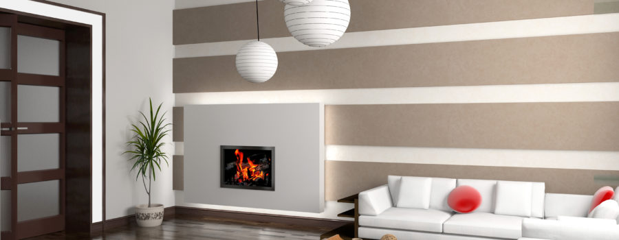
A space that is aesthetically pleasing always inspires us. You can set yourself up with a winning design by understanding the principle of balance in interior design. Balance creates a feeling of equilibrium with a cohesive ambiance. It feels just right. You can achieve balance in your own home with a little basic knowledge. The elements of proportion and scale are necessary to keep in mind when working with balance.
Everything on either side of the room does not have to be the same height and width. In fact, the style that you resonate with will dictate how you use balance in your space. There are three different types of balance: symmetrical balance, aesthetic balance and radial balance.
Symmetrical balance works best in traditional or formal styles. Symmetrical balance is where a space is evenly split into two sides that mirror each other. For example, place bookshelves on either side of the fireplace. This kind of balance is easy to achieve. If you are not careful, this kind of balance can become monotonous and boring. To avoid a boring and uninteresting space, think about the way that you incorporate line, color, and texture.
In a contemporary, modern, or transitional style you can achieve balance that is informal and still aesthetically pleasing to the eye. Balance without exact duplication is called asymmetrical balance. Balance occurs when elements are placed unevenly in a piece, but work together to produce harmony overall. Aesthetic balance uses visual weight. Achieve balance by being aware of how heavy an object looks irrespective of its actual weight. There are many ways an object could look heavier or lighter than it actually is. Placing a glass table in a small space can make the space feel bigger. Now add a large coffee table and you’re in business. When using asymmetrical balance you still need to keep in mind the use of line, color, and texture. Shape and form also becomes an important component to help you achieve balance.
Radial balance is achieved when there is a central focal point with other elements around it. It is often used in contemporary, modern or eclectic style. Radial balance requires a lot of repetition of form, texture, and color. It could be quite difficult for the untrained eye but when done right can create a very pleasing and interesting space. The easiest place to achieve this in is a dining room with a round dining table and chairs arranged around it. Another example is a sofa being balanced by placing two chairs on the other side then placing a narrow coffee table in front of the sofa with a bench in front of that.
In interior design, balance goes hand-in-hand with the elements of proportion and scale. Keep in mind that proportion is the ratio between the size of one part to another, and scale is how the size of one of the objects relates to another or to the space that it’s in.
Scale is very important for a room to look and feel right. Your furniture should be scaled according to the space you have. Larger rooms call for larger scaled furniture, and larger scaled pieces tend to look good when you place them with similarly proportioned pieces. Look for pieces that are functional and scaled appropriately to the space. The proportional relationship of the objects you have in your room will create a more pleasing space if the ratio of the smaller objects to larger objects is the same as the ratio between the larger objects to the whole space.
May you be on your way to creating a beautiful space that feels good and is inspiring.
We design, we build, we furnish…. Spaces that inspire you.


